
MODEL NEIGHBOURHOOD
Your model neighbourhood is already up and waiting
For every Primary Care Network in England, Joy has already sized the whole neighbourhood model: the demand target, the link-worker layer, the community services split, and the acute activity you could avoid. Tell us your PCN and we will send you a personal link to see it live.
See my neighbourhoodWhat the model shows, out of the box
This is the page section by section, shown as illustrations for a fictional inner-city neighbourhood of about 34,000 people. The names and figures are made up, but the layout and logic match what the tool produces. Your own page computes every number live for your PCN, from the real evidence in the Joy estate.
01
Local context, drafted from the area's own evidence
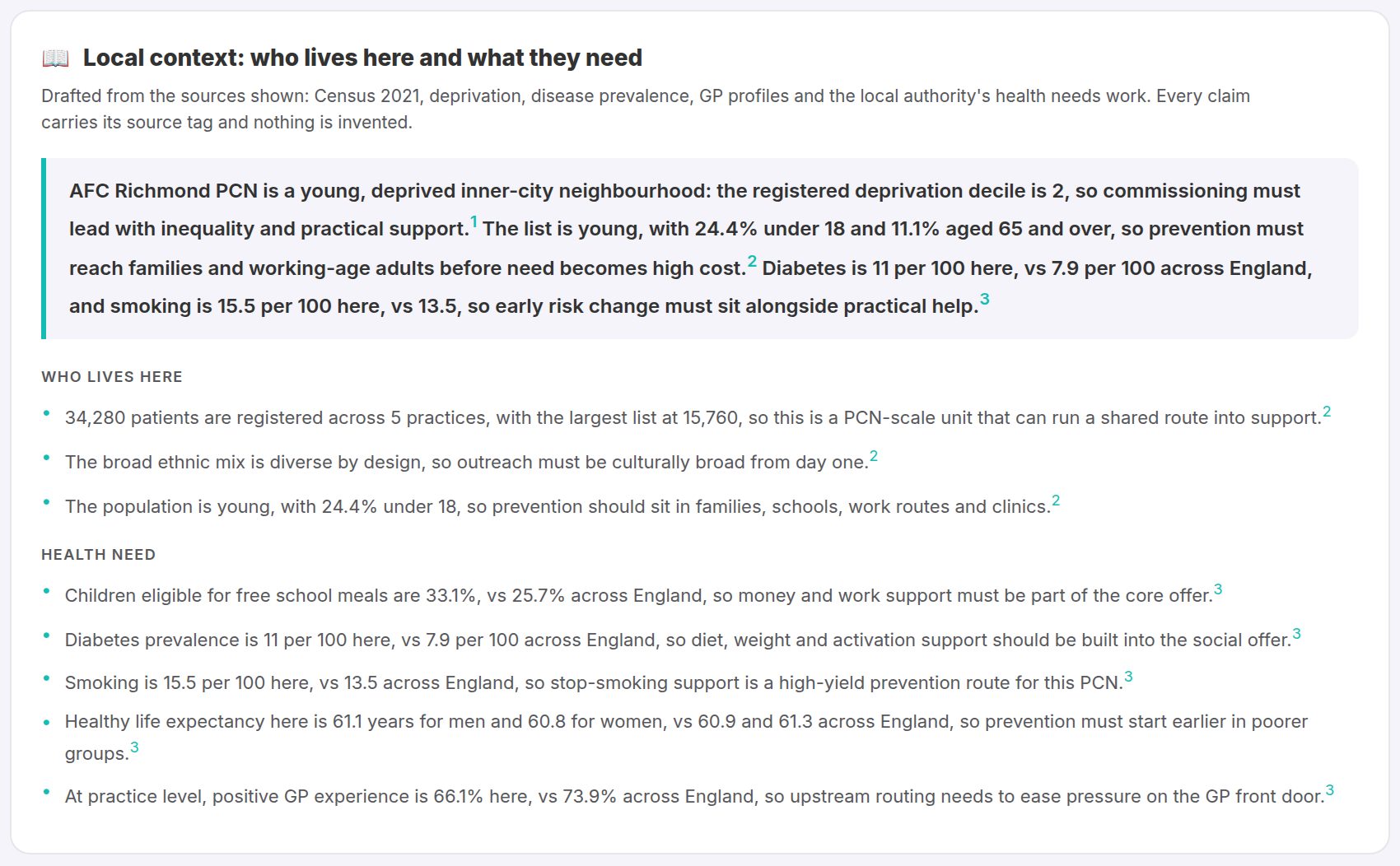
The page opens with a narrative of the neighbourhood: population, deprivation, health need and current activity, drafted from public data and the live Joy estate. Every figure links back to where it came from. Illustrated here for a fictional PCN.
02
Healthy years: the gap the model is aiming at
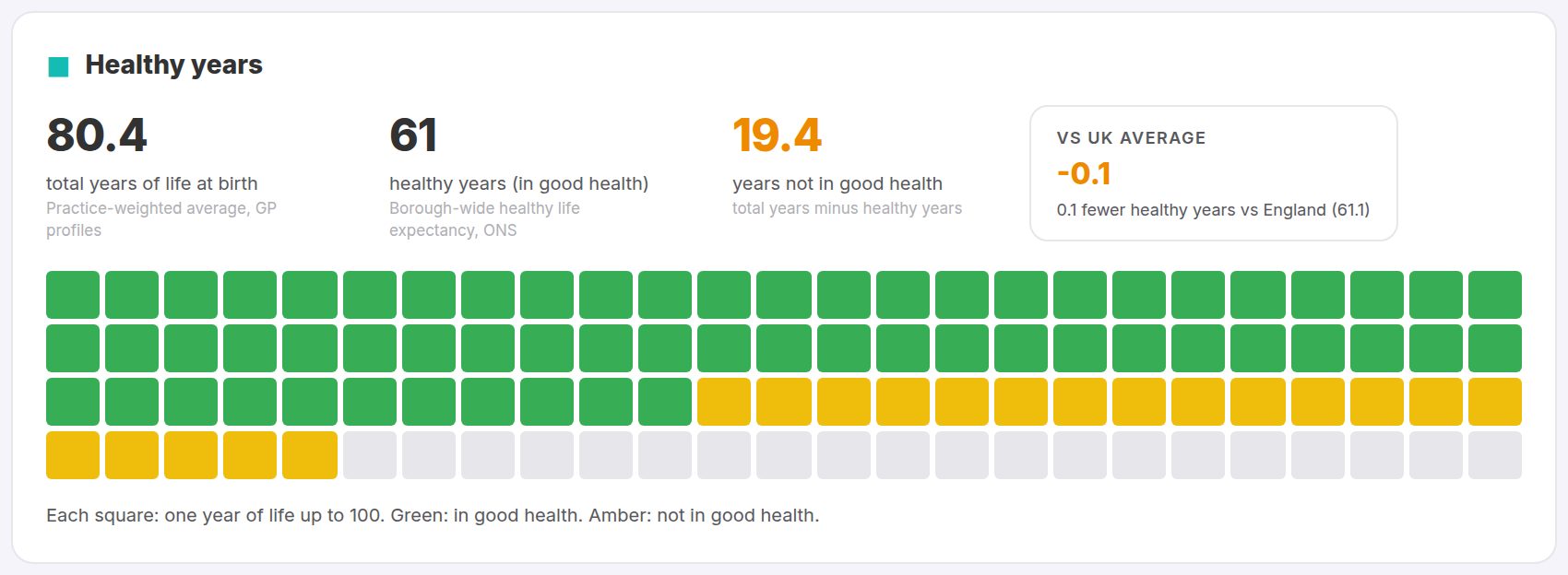
Life expectancy and healthy life expectancy for the area against the national picture: the years lived in poor health that a neighbourhood service is trying to win back.
03
Goals: the Triple Aim, localised
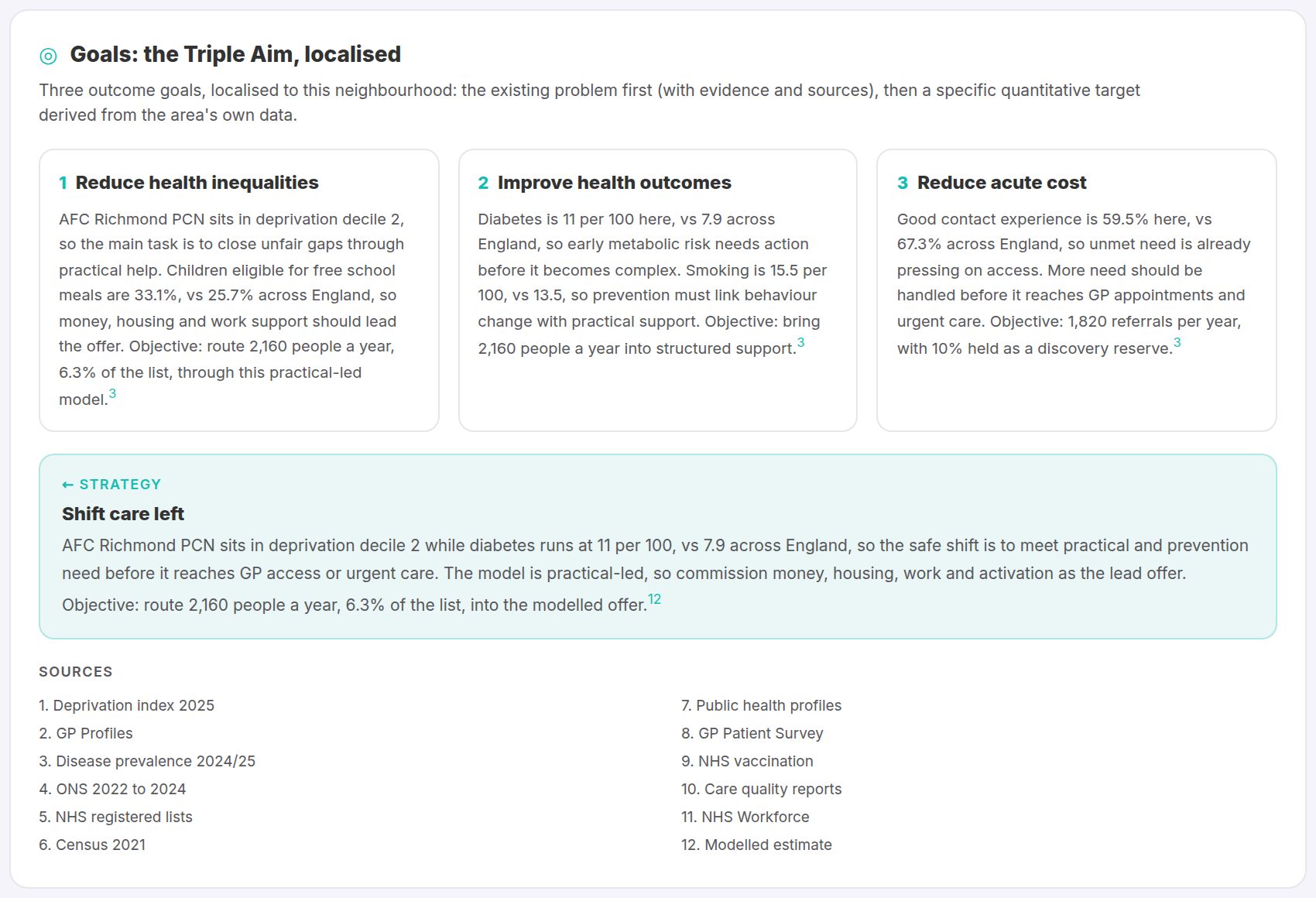
Three outcome goals grounded in the area's own numbers (inequalities, outcomes, acute cost), each with evidence, a quantitative target and the shift-care-left strategy that ties them together.
04
People: who leads this neighbourhood
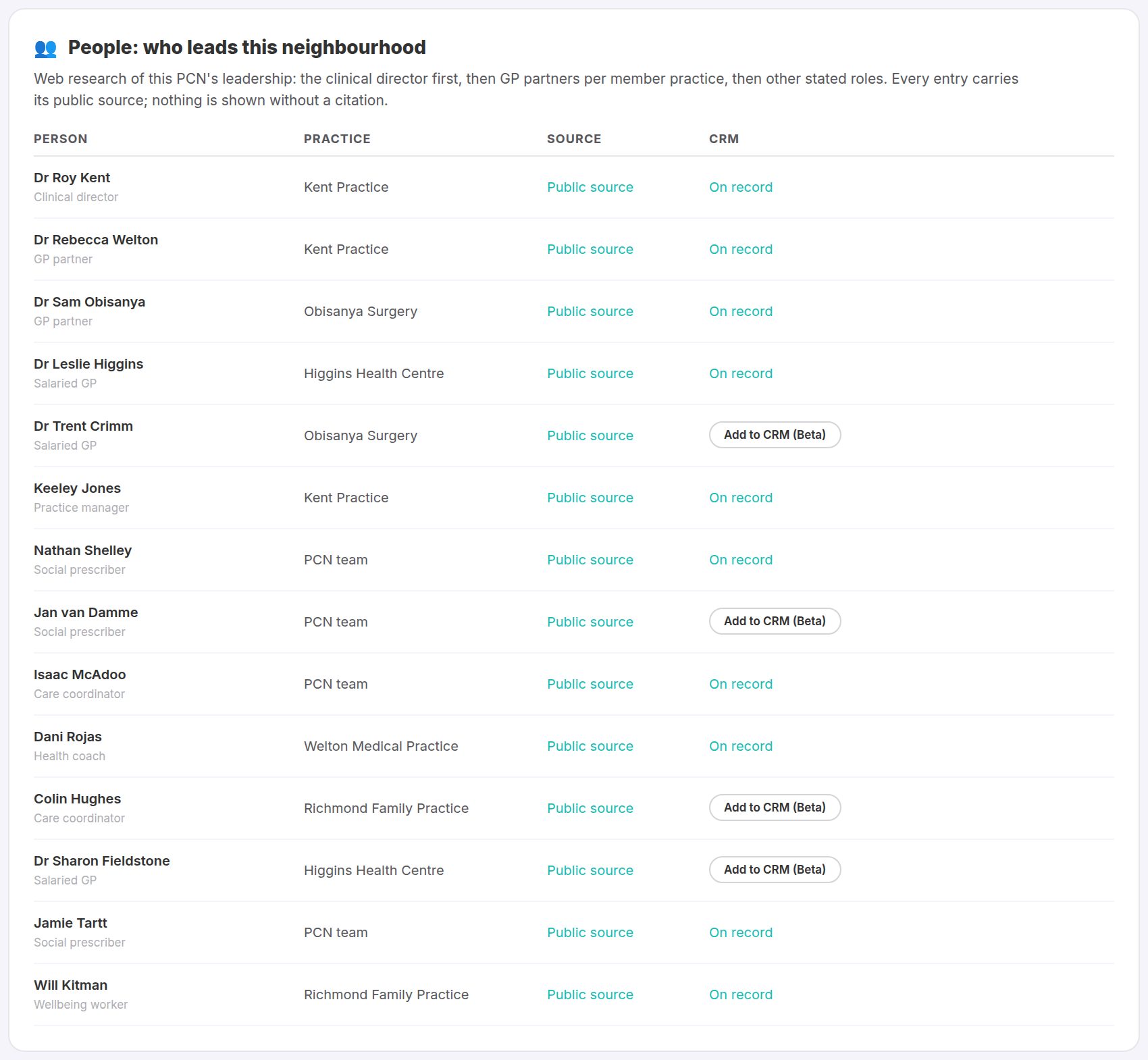
Web-researched leadership for the PCN: clinical director, GP partners and managers per member practice, each row showing its public source. Illustrated here with made-up names; your page shows the real people.
05
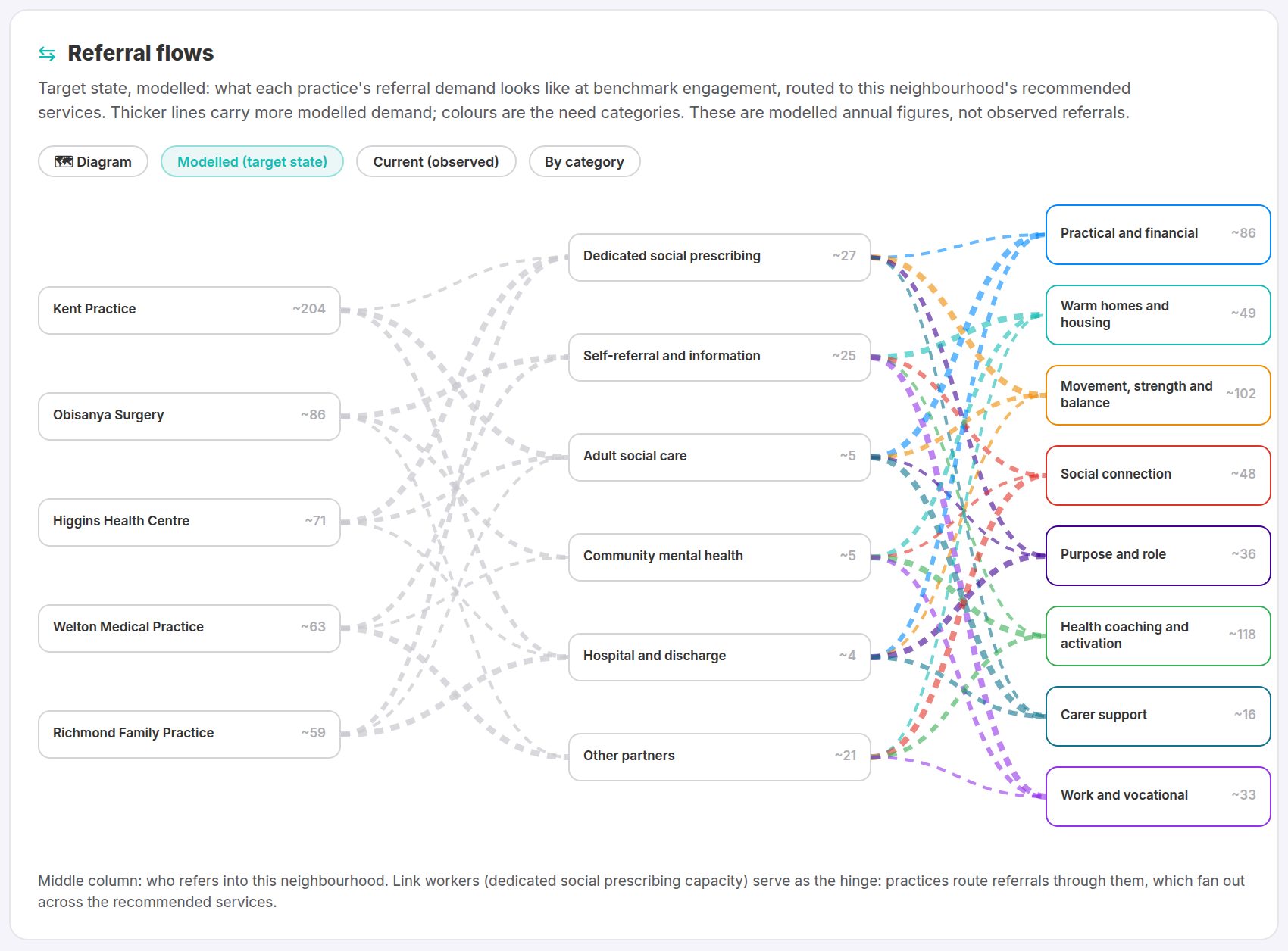
Referral flows: practices, referral routes, services
A modelled target-state flow map: each practice's referral demand passes a middle column of the routes that refer into the neighbourhood (link workers as the social-prescribing hinge, alongside self-referral, social care, mental health and hospital teams) and fans out across the recommended community services by need category.
06
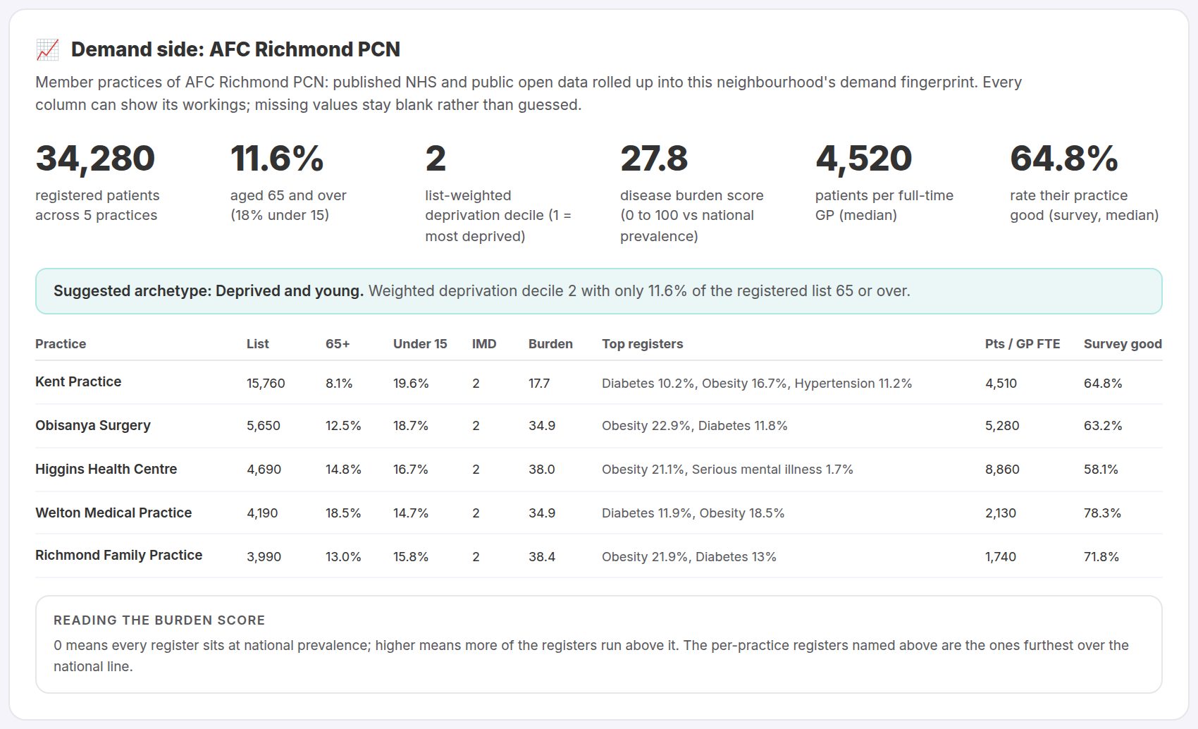
Demand side: the member practices, from open data
Published NHS, OHID, MHCLG and CQC open data rolled up into the neighbourhood's demand fingerprint: list sizes, deprivation, disease burden, workforce pressure and patient experience per practice.
07
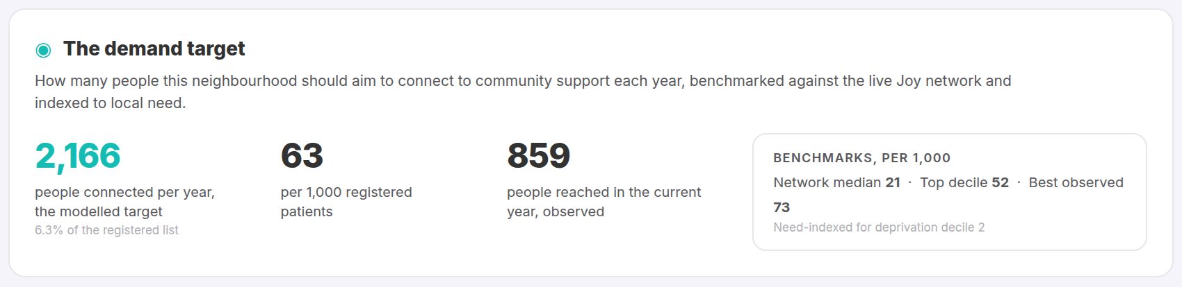
The demand target
How many people this neighbourhood should aim to connect to local services each year, benchmarked against the whole live Joy estate and indexed to local need.
08
The link-worker layer
The held-caseload capacity the target implies (full-time equivalents at a realistic cases-per-FTE), alongside the direct-to-service referrals the platform routes without a held case.

09
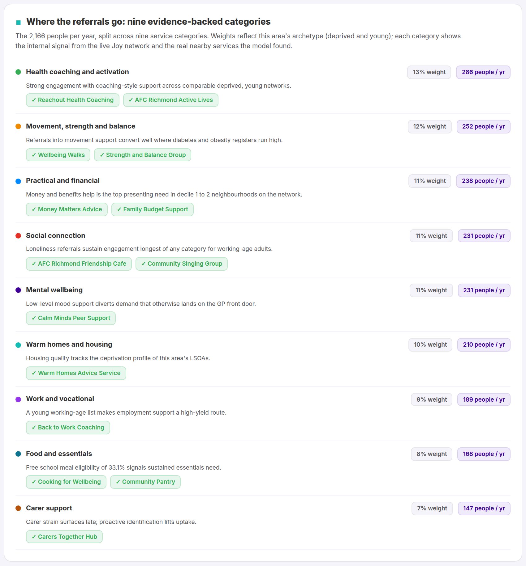
Nine evidence-backed service categories
Where the referrals go: nine categories with weights for this area's archetype, each backed by an internal signal from the Joy network and external evidence, with real nearby services listed under each.
10
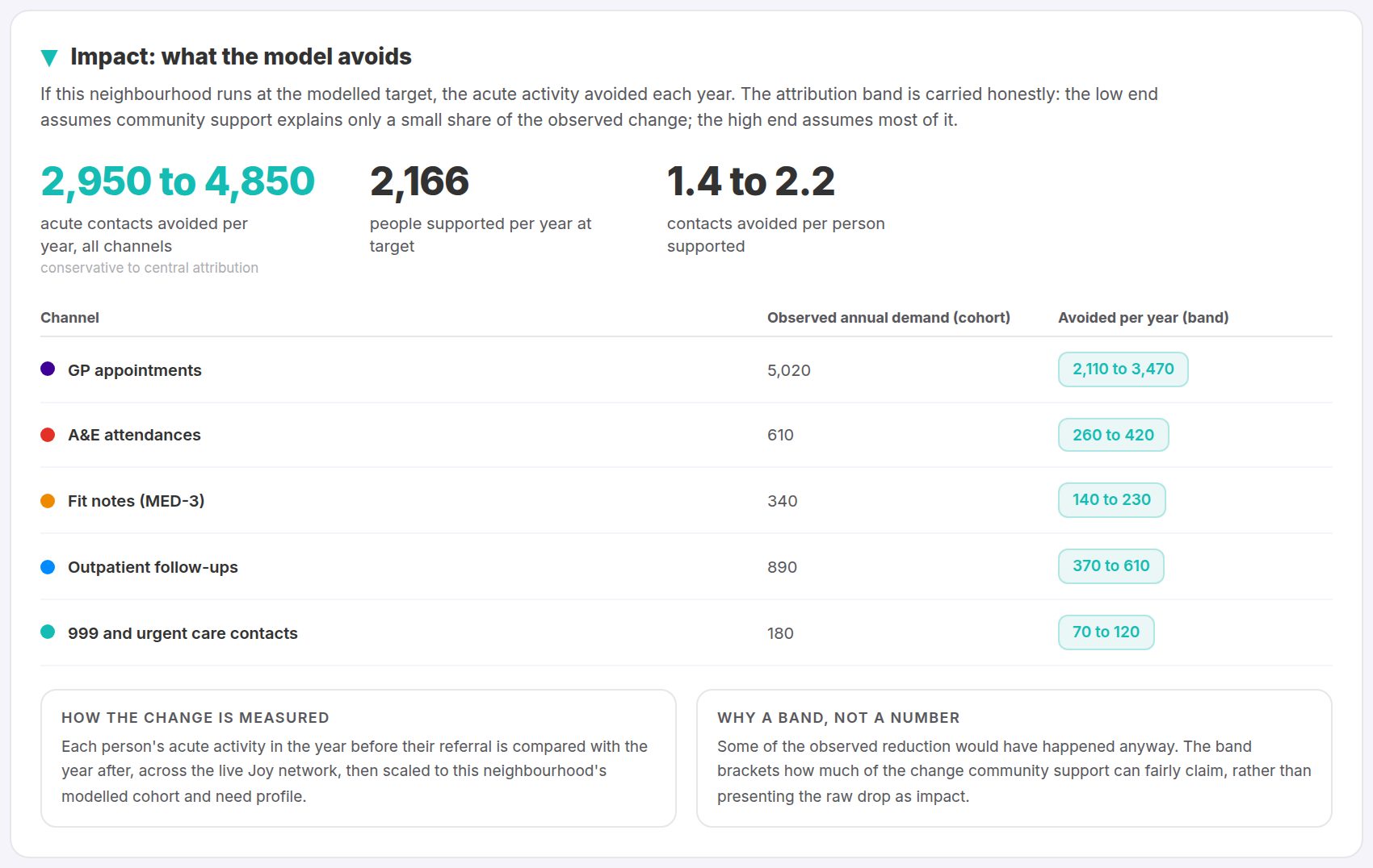
Impact: what the model avoids
The acute activity the modelled service would avoid (GP contacts, A&E attendances, fit notes), with the attribution band shown in full.
11
Return on investment
What the model costs per patient supported and what it returns in avoided acute demand over two years, showing the range around each figure, not only the headline.

12
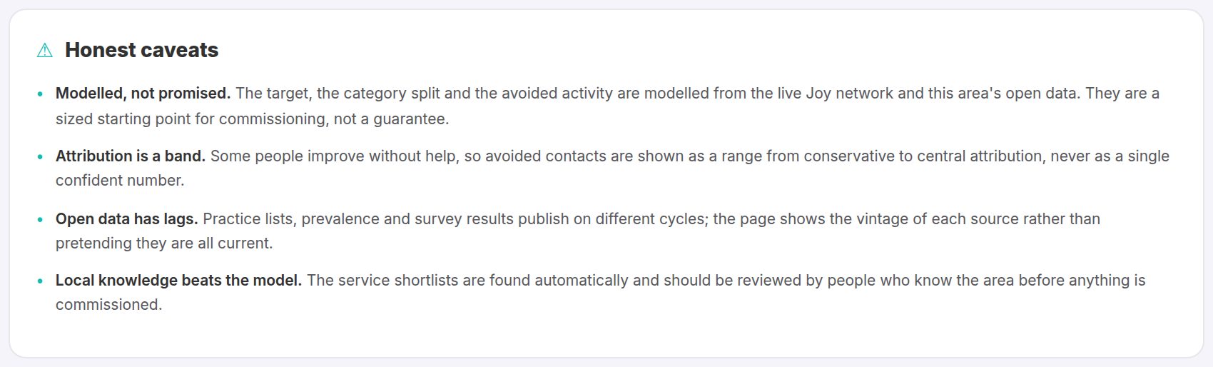
Honest caveats
The page closes with its limitations: what is measured, what is modelled, and where the uncertainty sits. Every number on the live page traces back to its source.
These panels are illustrations of the Model Neighbourhood page, drawn to match the product with fictional practices, services, people and figures. Every number on the live page can show its workings, down to source system and field.
Three neighbourhoods, three different models
The model is not one-size-fits-all: it reads each area's population, deprivation and current activity, then sizes the service that fits. These are three real neighbourhoods where Joy runs today, anonymised by rounding. The network's best neighbourhood already reaches more than 7% of its population every year.
BASED ON A TRUE STORY
An east London PCN
High deprivation, strong install base, big headroom
TODAY
Population
≈59,000
People reached / yr
≈1,700
Reach
≈2.9%
MODELLED
Target reach
6.1% (need-indexed)
People reached / yr
≈3,600
GP and A&E contacts avoided / yr
≈4,100
One of the most deprived boroughs in the country, with JoyConnect devices already installed across its practices. The model shows the headroom as usage steps up to the need-indexed target.
Real figures from a live Joy neighbourhood and its need-indexed model, rounded so the area stays anonymous. Avoided contacts use the conservative attribution band.
BASED ON A TRUE STORY
A market-town PCN in the North West
Established service, within reach of target
TODAY
Population
≈32,000
People reached / yr
≈1,200
Reach
≈3.7%
MODELLED
Target reach
4.7% (need-indexed)
People reached / yr
≈1,500
GP and A&E contacts avoided / yr
≈1,700
A mature social prescribing service embedded in general practice, already referring within sight of its target. The model sizes the next step: modest extra link-worker capacity concentrated on the highest-need practices.
Real figures from a live Joy neighbourhood and its need-indexed model, rounded so the area stays anonymous. Avoided contacts use the conservative attribution band.
BASED ON A TRUE STORY
A commuter-belt PCN in the South East
Lower deprivation, targeted model
TODAY
Population
≈32,000
People reached / yr
≈640
Reach
≈2.0%
MODELLED
Target reach
3.2% (need-indexed)
People reached / yr
≈1,000
GP and A&E contacts avoided / yr
≈1,150
Among the least deprived areas nationally, with pockets of real need. The model sizes a leaner, targeted service rather than copying what a high-deprivation area would run.
Real figures from a live Joy neighbourhood and its need-indexed model, rounded so the area stays anonymous. Avoided contacts use the conservative attribution band.
See the real thing for your own PCN
Your neighbourhood is already modelled and pre-warmed on the live Joy platform. Request your link and open it in minutes.
- Search for your Primary Care Network by name.
- Enter your NHS or public sector email address.
- We email you a personal link, live for 30 days, pinned to your neighbourhood.
For NHS and public sector teams: we can only send links to nhs.net, nhs.uk or gov.uk addresses. The Joy team may follow up personally about your neighbourhood.